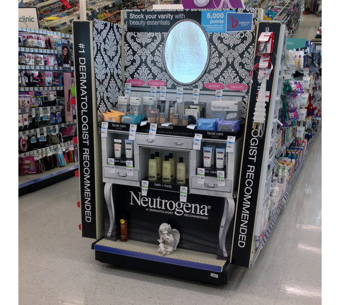
A worldwide leader in premium, dermatologist-recommended skin, hair and cosmetics products, Neutrogena has been providing consumers with health and beauty improvements for over 40 years. No stranger to in-store promotions, Neutrogena was front and center at Walgreens with a very stylish end cap display during a recent multi-product promotion.
Several different products from Neutrogena’s extensive brand portfolio were merchandised on this display – facial care, cosmetics, sun care bath + body. We counted almost 20 different variants across all of those product lines which were neatly grouped and organized by category.
You probably noticed all of the price point stickers plastered on the display………..speaking for the graphic design and brand folks to point out that it’s kind of a bummer to create art based upon any retailers style guide only to find that your lovely efforts have been covered over by price stickers or chain-specific print outs.
In any event, “stickering” displays happens everyday and at most retail chains. It’s probably safe to say that the display still achieved it’s desired results and is still an awesome design effort. Now onto some of the cool things that contributed to the cause!
Where to begin? Let’s start by highlighting the Victorian-themed wall covering. This black & white motif creates a lot of visual interest and serves as a luxurious background which compliments the vanity design. The mylar mirror provides the finishing touch!
Moving down to the vanity…..from the drawer pulls down to the legs, what a convincing effort on the graphic designers part. The grey washed-out wood finish against the solid black accents causes this display to really jump out. Great idea to include the three little product cubbies as well. Overall, a solid effort both graphically and structurally. Not sure that the guardian angel was included with the display but it does fit in well with the theme!